# Matplotlib Essentials
July 3, 2026 Python Data Fundamentals
The foundational plotting library that powers Python's data science stack, letting you visualize anything from quick exploratory charts to publication-ready figures. This article covers the most essential use-cases.
Installation
$ pip install matplotlib

# optional (may be required for displaying charts interactively).
$ pip install PyQt6
Basic Example
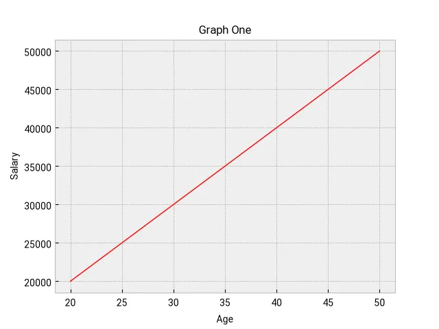
from matplotlib import pyplot as plt


def main() -> None:
    x_axis = [20, 25, 30, 35, 40, 45, 50]
    y_axis = [20_000, 25_000, 30_000, 35_000, 40_000, 45_000, 50_000]

    # print plt.style.available to get all available styles.
    plt.style.use("bmh")
    plt.rcParams["font.family"] = "Roboto"

    plt.grid(True)
    plt.title("Graph One", fontsize="12")
    plt.xlabel("Age", fontsize=10)
    plt.ylabel("Salary", fontsize=10)

	# create a line plot.
    plt.plot(x_axis, y_axis, linewidth=1, color="#ff0000")
    plt.show()

    # save to disk.
    plt.savefig("output.png")
Note: Time-series data can also be graphed in exactly the same way: dates (either datetime object or str) will be on the x-axis, their values on the y-axis.
Graphing multiple values
    x_axis = [20, 25, 30, 35, 40, 45, 50]
    y_axis = [20_000, 25_000, 30_000, 35_000, 40_000, 45_000, 50_000]
    y_axis_2 = [30_000, 25_000, 40_000, 38_000, 39_000, 40_000, 45_000]

    # print plt.style.available to get all available styles.
    plt.style.use("bmh")
    plt.rcParams["font.family"] = "Roboto"

    plt.grid(True)
    plt.title("Graph One", fontsize="12")
    plt.xlabel("Age", fontsize=10)
    plt.ylabel("Salary", fontsize=10)

    plt.plot(x_axis, y_axis, linewidth=1, color="#ff0000")
    plt.plot(x_axis, y_axis_2, linewidth=1, color="#0072ff", linestyle="--")

    plt.show()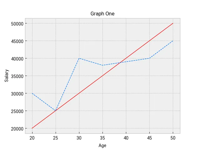
Mixing bar and line plot
plt.bar(x_axis, y_axis, linewidth=1, width=0.5, color="#ff0000")
plt.plot(x_axis, y_axis_2, linewidth=1, color="#0072ff", linestyle="--")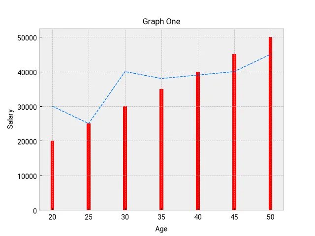
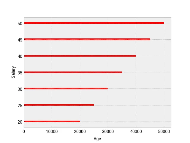
Horizontal Bar graph
plt.xlabel("Age", fontsize=10)
plt.ylabel("Salary", fontsize=10)

plt.barh(
    x_axis, y_axis, linewidth=1, height=0.5, color="#ff0000", label="Median Salary"
)
Adding a legend
If we want to display a legend, our bar, plot etc. calls should have a label value.
plt.bar(
    x_axis, y_axis, linewidth=1, width=0.5, color="#ff0000", label="Median Salary"
)

plt.plot(
    x_axis,
    y_axis_2,
    linewidth=1,
    color="#0072ff",
    linestyle="--",
    label="Local Salary",
)

plt.legend(loc="upper right")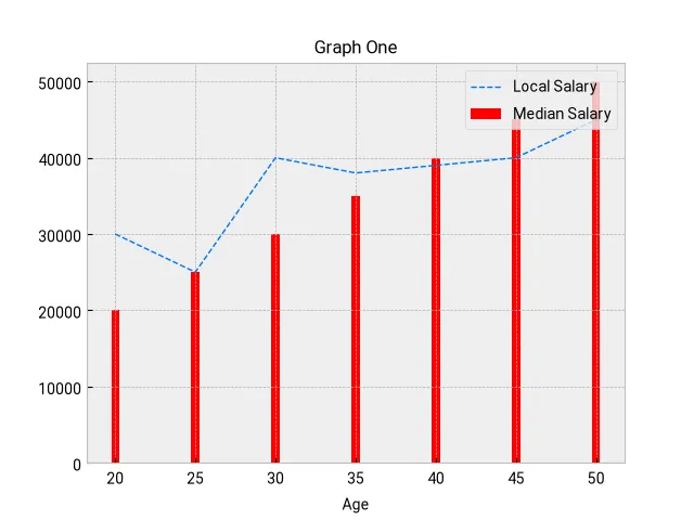
Adding comparative bars
developers = {
    "age": [25, 26, 27, 28, 29, 30, 31, 32, 33, 34, 35],
    "median_salary": [
        38496,
        42000,
        46752,
        49320,
        53200,
        56000,
        62316,
        64928,
        67317,
        68748,
        73752,
    ],
    "py_median_salary": [
        45372,
        48876,
        53850,
        57287,
        63016,
        65998,
        70003,
        70000,
        71496,
        75370,
        83640,
    ],
    "js_median_salary": [
        37810,
        43515,
        46823,
        49293,
        53437,
        56373,
        62375,
        66674,
        68745,
        68746,
        74583,
    ],
}


def main() -> None:
    # print plt.style.available to get all available styles.
    plt.style.use("ggplot")
    plt.rcParams["font.family"] = "Roboto"
    plt.grid(True)

    x_indices = np.arange(len(developers["age"]))
    plt.xticks(ticks=x_indices, labels=developers["age"])
    bar_width = 0.25

    # draw center bar.
    plt.bar(
        x_indices,
        developers["median_salary"],
        label="All devs",
        width=bar_width,
    )

    # by default, all bars are overlayed. Here we are shifting one the of the bars
    # to the right
    plt.bar(
        x_indices + bar_width,
        developers["py_median_salary"],
        label="Python dev",
        width=bar_width,
    )

    # shift bars to the left
    plt.bar(
        x_indices - bar_width,
        developers["js_median_salary"],
        label="JS dev",
        width=bar_width,
    )

    plt.title("Developer median salaries")
    plt.xlabel("Developer Age")
    plt.ylabel("Median salary")

    plt.legend()
    plt.show()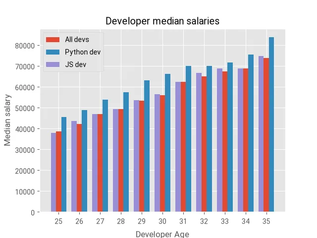
Stacked Plot
def main() -> None:
    # print plt.style.available to get all available styles.
    plt.style.use("fast")
    plt.rcParams["font.family"] = "Roboto"

    # following is equivalent to: [i for i in range(1, 10)]
    minutes = np.arange(9)

    scores = {
        "player_one": [1, 2, 3, 3, 4, 4, 4, 4, 5],
        "player_two": [1, 1, 1, 1, 2, 2, 2, 3, 4],
        "player_thr": [1, 1, 1, 2, 2, 2, 3, 3, 3],
    }

    labels = ["Player One", "Player Two", "Player Three"]

    plt.stackplot(
        minutes,
        scores["player_one"],
        scores["player_two"],
        scores["player_thr"],
        labels=labels,
    )

    plt.title("Player scores")
    plt.xlabel("Minutes")
    plt.ylabel("Scores")
    plt.legend(loc="upper left")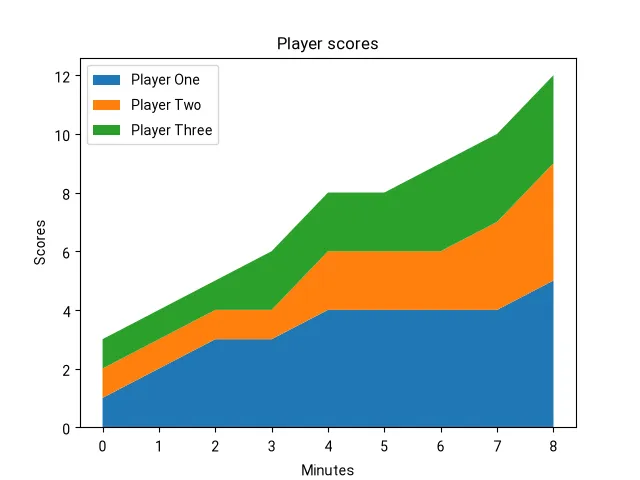
Scatter Plot
Scatter plots are very useful in visualizing correlations and outliers.
def main() -> None:
    plt.style.use("fast")
    plt.rcParams["font.family"] = "Roboto"
    plt.grid(True)

    # random data: 50 (x,y) points between (0,0) and (100,100).
    n = 50
    x = np.random.randint(0, 101, size=n)
    y = np.random.randint(0, 101, size=n)
    colors = np.random.randint(0, 11, size=n)

    plt.scatter(x, y, s=50, c=colors, cmap="Greens")

    cbar = plt.colorbar()
    cbar.set_label("Satisfaction")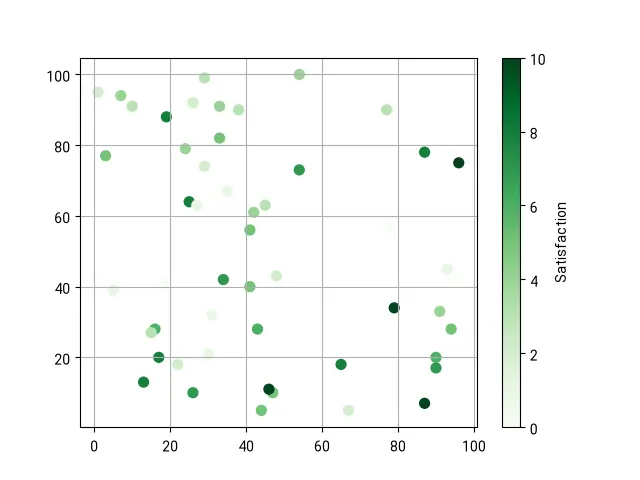
Encapsulating chart into a class
from matplotlib import pyplot as plt
from matplotlib.axes import Axes
from matplotlib.figure import Figure
from dataclasses import dataclass
import os


@dataclass
class SalaryByAgeEntry:
    age: int
    salary: int


class SalaryByAgeChart:
    __fig: Figure
    __ax: Axes

    def __init__(self, title: str) -> None:
        self.__fig, self.__ax = plt.subplots()
        self.__ax.grid(True)
        self.__ax.set_title(title)
        self.__ax.set_xlabel("Age", fontsize=10)
        self.__ax.set_ylabel("Salary", fontsize=10)

    def plot(self, data: list[SalaryByAgeEntry], filename="chart.png") -> str:
        self.__ax.plot(
            [e.age for e in data],
            [e.salary for e in data],
            linewidth=1,
            color="#ff0000",
        )

        save_path = os.path.join(os.getcwd(), filename)
        self.__fig.savefig(save_path)
        return save_path


def main() -> None:
    plt.style.use("fast")
    plt.rcParams["font.family"] = "Roboto"

    data = [
        SalaryByAgeEntry(20, 20_000),
        SalaryByAgeEntry(25, 25_000),
        SalaryByAgeEntry(30, 30_000),
        SalaryByAgeEntry(35, 35_000),
        SalaryByAgeEntry(40, 40_000),
        SalaryByAgeEntry(45, 45_000),
        SalaryByAgeEntry(50, 50_000),
    ]

    chart = SalaryByAgeChart(title="Salary By Age")
    chart_path = chart.plot(data, "salaries-chart.png")
print(chart_path)Note: This is the same chart as the first-one in this document.